@animate-ui
Animated components · data updated 2026-09-05
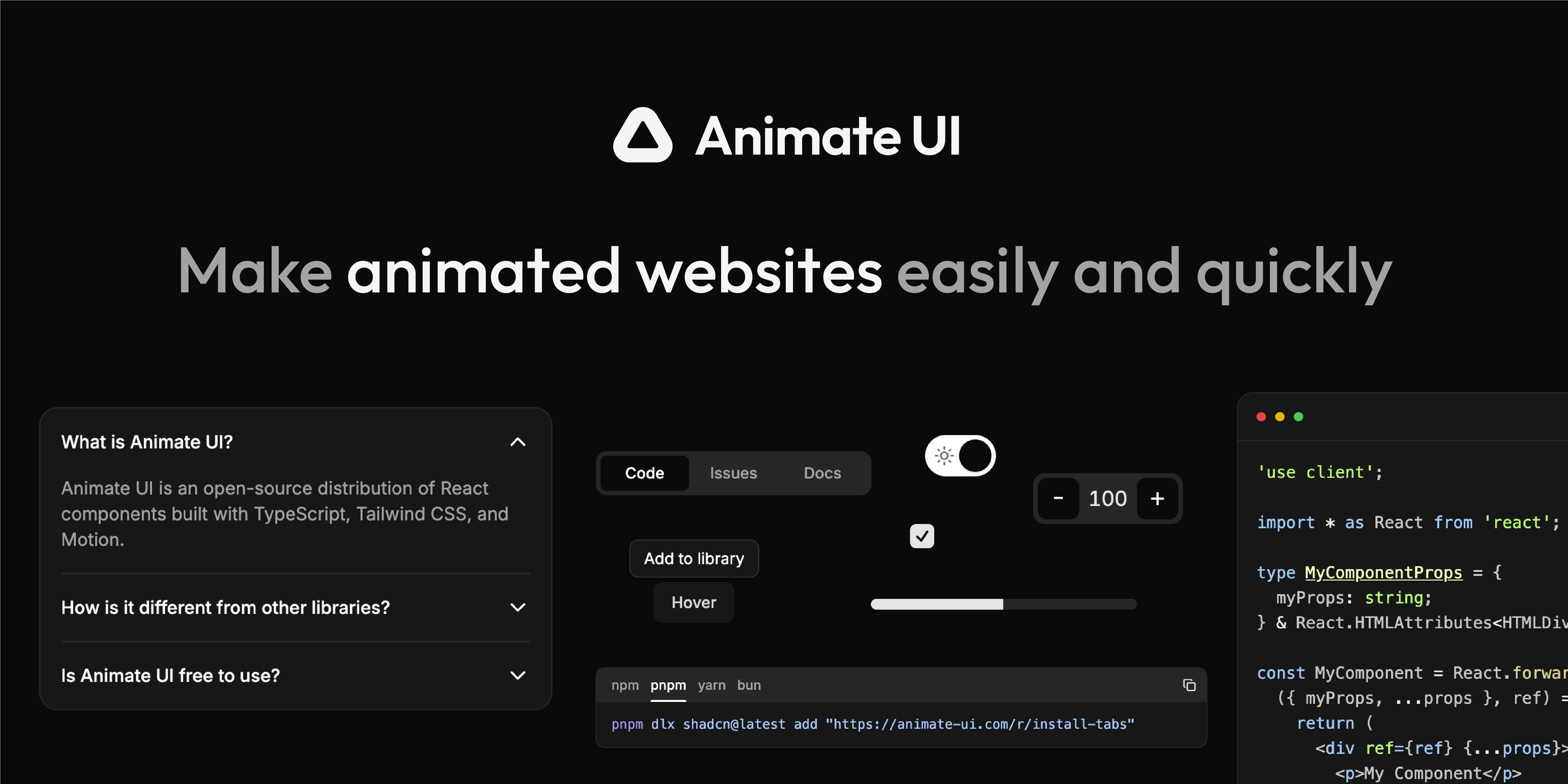
Fully animated open-source React component distribution built with TypeScript, Tailwind CSS, and Motion (formerly Framer Motion). Three component tiers: animated Radix-wrapped primitives (accordion, alert-dialog, checkbox, dialog, dropdown-menu, files, hover-card, popover, progress, radio-group, sheet, sidebar, switch, tabs, toggle, tooltip), Base UI-backed variants of the same set, and custom Animate components (avatar-group, code, code-tabs, cursor, github-stars-wheel, tabs, tooltip). Also includes animated Lucide icons. MCP server available. Free, MIT-licensed. Use for: any React app that wants smooth, physics-based transitions on standard shadcn/ui primitives without writing animation logic manually.
Install
npx shadcn@latest add https://animate-ui.com/r/registry.jsonHealth
Components (580)
Preview
Live sandbox previews render component source client-side. Where a component can’t be rendered standalone, sh4dcn falls back to its source and install command.