Registries
ActiveAnimated components32

@animbits

Animated components · MIT · data updated 2026-07-28

Production-ready Framer Motion animation component library for React (Next.js 15, TypeScript 5.9). Ships 50+ copy-paste animation components organized into: Icons (heartbeat, pulse, bounce, spin, wiggle, shake, pop, rotate, stroke-draw, fade-in, scale-in), Buttons (lift, ripple, magnetic, glow), Cards, Loaders, Lists, and Page Transitions, plus animation hooks. All components respect prefers-reduced-motion. Install via shadcn CLI. Free, MIT-licensed, dark-mode ready. Use for: adding tasteful, non-flashy micro-interactions to existing components — particularly icons and buttons — in Next.js or Vite projects.
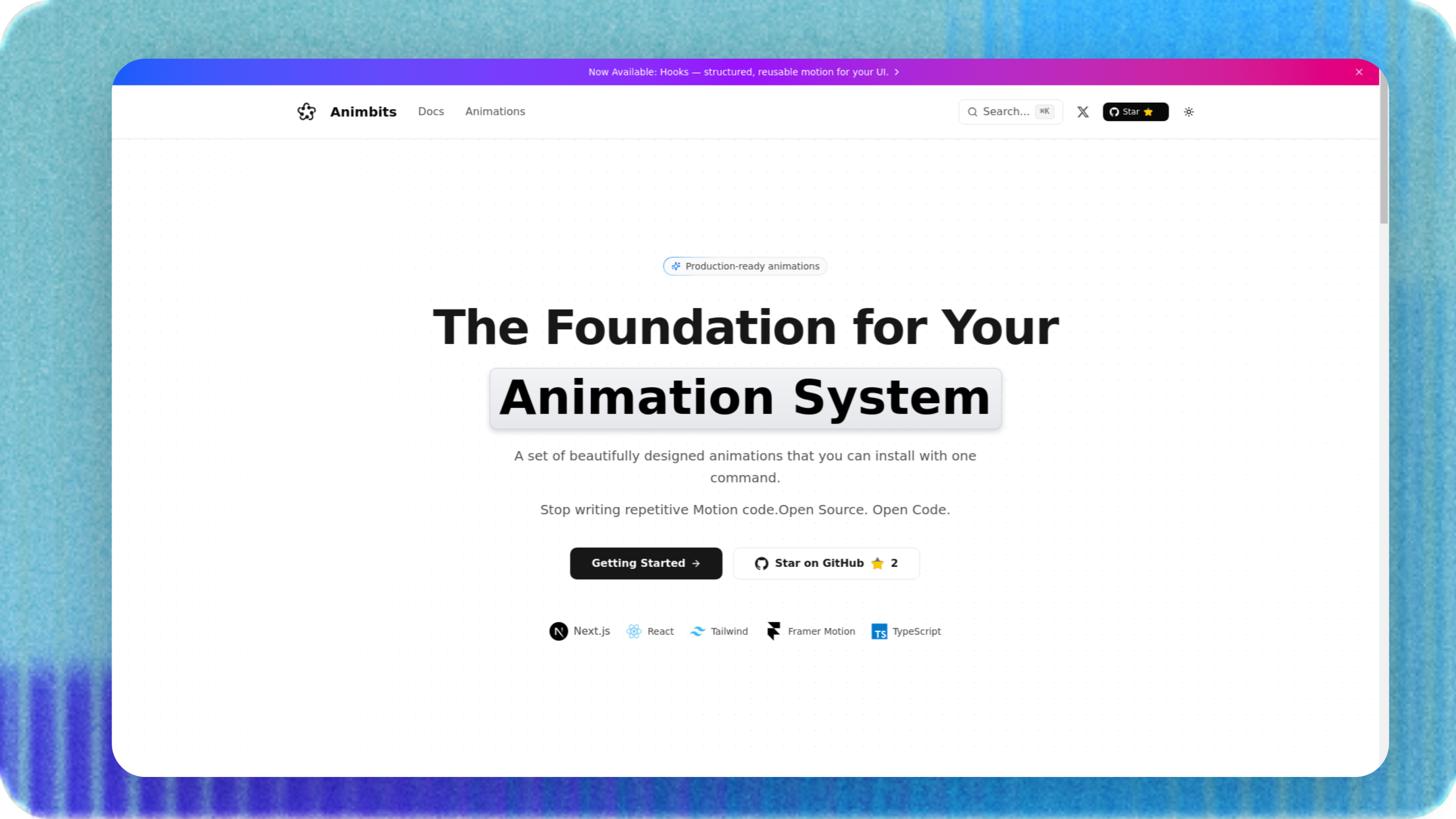
@animbits preview
aestheticanimationbackgroundsbuttonscardsdesign-systemglassmorphismhooksiconsloadersmedianavigationoverlaystext-effectstheming

Install

npx shadcn@latest add https://animbits.dev/r/registry.json

Health

StatusActive
Last commit1 month ago
LicenseMIT
Open issues0
ArchivedNo
Stars32

Components (99)

hooks-use-hover-lifthooks-use-hover-glowhooks-use-presshooks-use-fade-inhooks-use-scale-inhooks-use-slide-inhooks-use-pulsehooks-use-bouncehooks-use-shimmerhooks-use-scramblehooks-use-word-carouselhooks-use-magnetichooks-use-parallax-tilthooks-use-stroke-drawhooks-indexicons-pulseicons-bounceicons-bounce-continuousicons-spinicons-wiggleicons-shakeicons-heartbeaticons-fade-inicons-scale-inicons-popicons-rotateicons-stroke-drawspecials-reaction-dockspecials-reaction-dock-demospecials-animated-toastspotlight-cardreaction-buttonspecials-border-beamspecials-border-beam-demobuttons-pressbuttons-glowbuttons-liftbuttons-shinebuttons-fade-inbuttons-slide-inbuttons-ripplebuttons-magneticbuttons-border-gradientcards-hover-liftcards-hover-glowcards-fade-incards-scale-incards-slide-incards-flipcards-tiltcards-parallax-tiltcards-background-zoomtext-fade-intext-slide-uptext-typewritertext-gradienttext-blur-intext-diatext-shimmertext-scramble
Components: hooks-use-hover-lift, hooks-use-hover-glow, hooks-use-press, hooks-use-fade-in, hooks-use-scale-in, hooks-use-slide-in, hooks-use-pulse, hooks-use-bounce, hooks-use-shimmer, hooks-use-scramble, hooks-use-word-carousel, hooks-use-magnetic, hooks-use-parallax-tilt, hooks-use-stroke-draw, hooks-index, icons-pulse, icons-bounce, icons-bounce-continuous, icons-spin, icons-wiggle, icons-shake, icons-heartbeat, icons-fade-in, icons-scale-in, icons-pop, icons-rotate, icons-stroke-draw, specials-reaction-dock, specials-reaction-dock-demo, specials-animated-toast, spotlight-card, reaction-button, specials-border-beam, specials-border-beam-demo, buttons-press, buttons-glow, buttons-lift, buttons-shine, buttons-fade-in, buttons-slide-in, buttons-ripple, buttons-magnetic, buttons-border-gradient, cards-hover-lift, cards-hover-glow, cards-fade-in, cards-scale-in, cards-slide-in, cards-flip, cards-tilt, cards-parallax-tilt, cards-background-zoom, text-fade-in, text-slide-up, text-typewriter, text-gradient, text-blur-in, text-dia, text-shimmer, text-scramble, text-word-carousel, text-split-reveal, text-svg-text-draw, loaders-spinner, loaders-dots, loaders-bars, loaders-pulse, loaders-skeleton, loaders-orbit, loaders-gooey-blobs, loaders-morphing, lists-slide-in, lists-stagger-fade, icons-morph, cards-grayscale, loaders-liquid-progress, pages-page-transition-fade, pages-page-transition-link, pages-page-transition-slide, transitions-shared-modal, transitions-expanding-card, transitions-tab-switcher, transitions-view-toggle, transitions-zoom-hollow, transitions-theme-toggle-circular, transitions-theme-toggle-slide-bottom, transitions-theme-toggle-slide-left, transitions-theme-toggle-slide-right, transitions-theme-toggle-slide-top, text-highlight, text-highlight-demo, specials-swipeable-stack, specials-swipeable-stack-demo, specials-magnetic-drawer, specials-magnetic-drawer-demo, specials-spotlight-card, specials-spotlight-card-demo, image-text, specials-linear-carousel

Preview

Live sandbox previews render component source client-side. Where a component can’t be rendered standalone, sh4dcn falls back to its source and install command.

@animbits · hooks-use-hover-lift

npx shadcn@latest add https://animbits.dev/r/hooks-use-hover-lift.json
View source