ActiveComponent library (general)vuepro available81
@boldkit
Component library (general) · MIT · data updated 2026-07-28
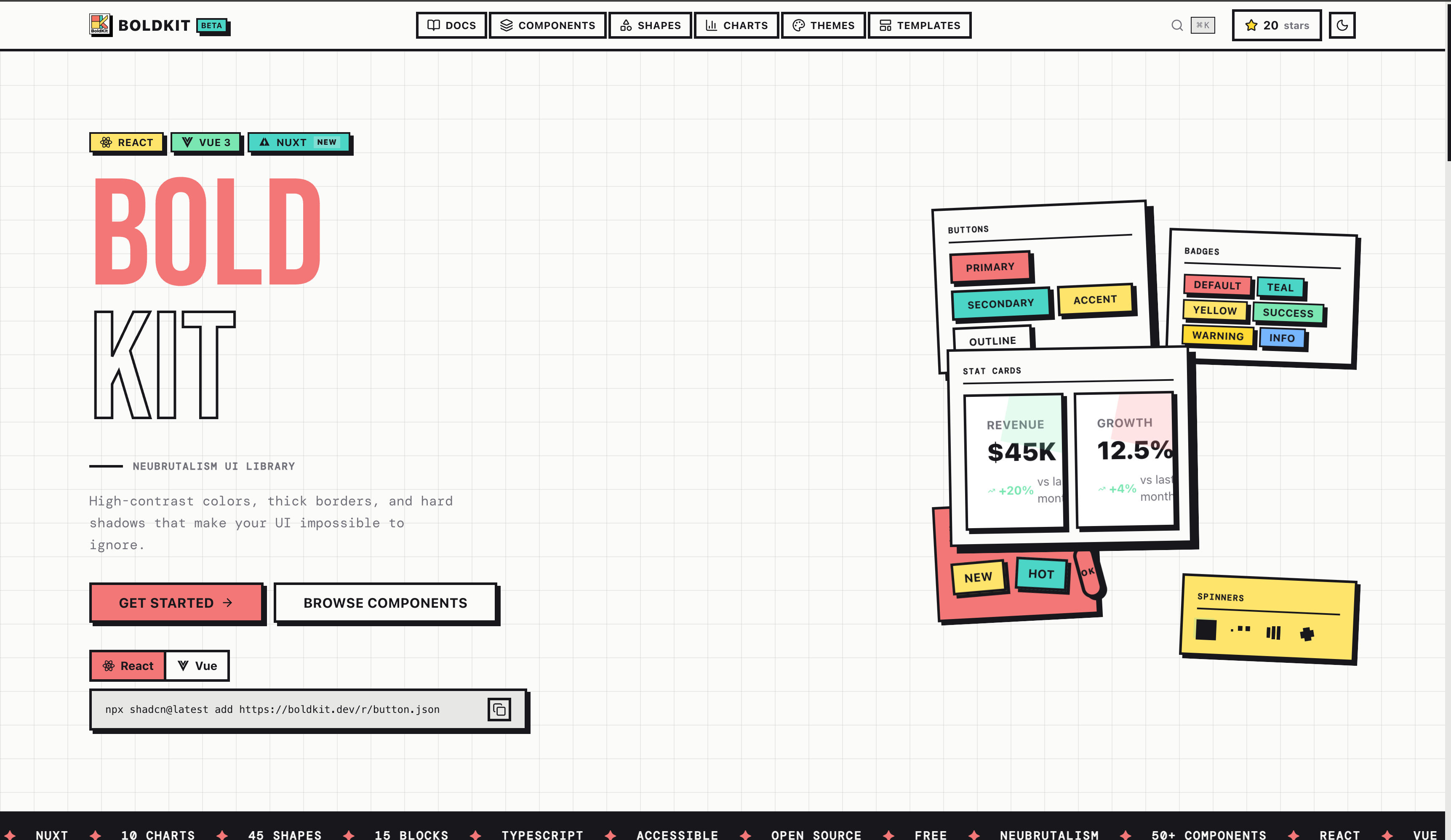
Free, open-source neubrutalism UI library supporting both React and Vue 3/Nuxt, installable via the shadcn CLI. Contains 56+ components, 15 section blocks, 7 full-page templates, 64 SVG shapes, and 14 chart types. Distinctive aesthetic: thick borders, hard shadows, and bold accent colors. Built on shadcn/ui (Radix UI) and shadcn-vue (Reka UI), Tailwind CSS v4, TypeScript. Use for: projects requiring a bold neubrutalism visual identity across both React and Vue stacks without switching libraries.
aestheticanimationauthbackgroundsblocksbuttonscardschartscomponentsdashboarddesign-systemformshooksloadersmapsmediamobilenavigationonboardingoverlayspro-availabletablestheming
Install
npx shadcn@latest add https://boldkit.dev/r/registry.jsonHealth
StatusActive
Last commit3 weeks ago
LicenseMIT
Open issues1
ArchivedNo
Stars81
Components (94)
themeutilsuse-themeerror-boundaryaccordionalertaspect-ratioavatarbadgebreadcrumbbuttoncardcheckboxcollapsiblecomboboxcommanddialogdropdown-menucontext-menumenubarnavigation-menuresizablebutton-groupinput-groupfieldnative-selectdate-pickerinputlabelpopoverprogressradio-groupscroll-areaselectseparatorsheetskeletonslidersonnerswitchtabletabstextareatoggletoggle-grouptooltipalert-dialogcalendardrawerhover-cardinput-otppaginationchartmarqueestickerlayered-cardshapesstylesspinnerkbd
Components: theme, utils, use-theme, error-boundary, accordion, alert, aspect-ratio, avatar, badge, breadcrumb, button, card, checkbox, collapsible, combobox, command, dialog, dropdown-menu, context-menu, menubar, navigation-menu, resizable, button-group, input-group, field, native-select, date-picker, input, label, popover, progress, radio-group, scroll-area, select, separator, sheet, skeleton, slider, sonner, switch, table, tabs, textarea, toggle, toggle-group, tooltip, alert-dialog, calendar, drawer, hover-card, input-otp, pagination, chart, marquee, sticker, layered-card, shapes, styles, spinner, kbd, stat-card, stepper, multi-step-form, dropzone, sparkline, donut-chart, radial-bar-chart, radar-chart, gauge-chart, funnel-chart, treemap-chart, heatmap-chart, sankey-chart, rating, tag-input, time-picker, date-range-picker, data-table, carousel, timeline, tree-view, sidebar, tour, empty-state, math-curves, math-curve-loader, math-curve-progress, math-curve-background, ascii-shapes, motion, motion-core, motion-react, chart-export, chart-toolbarPreview
Live sandbox previews render component source client-side. Where a component can’t be rendered standalone, sh4dcn falls back to its source and install command.