@launchui
Blocks & sections (marketing/SaaS) · MIT · data updated 2026-07-28
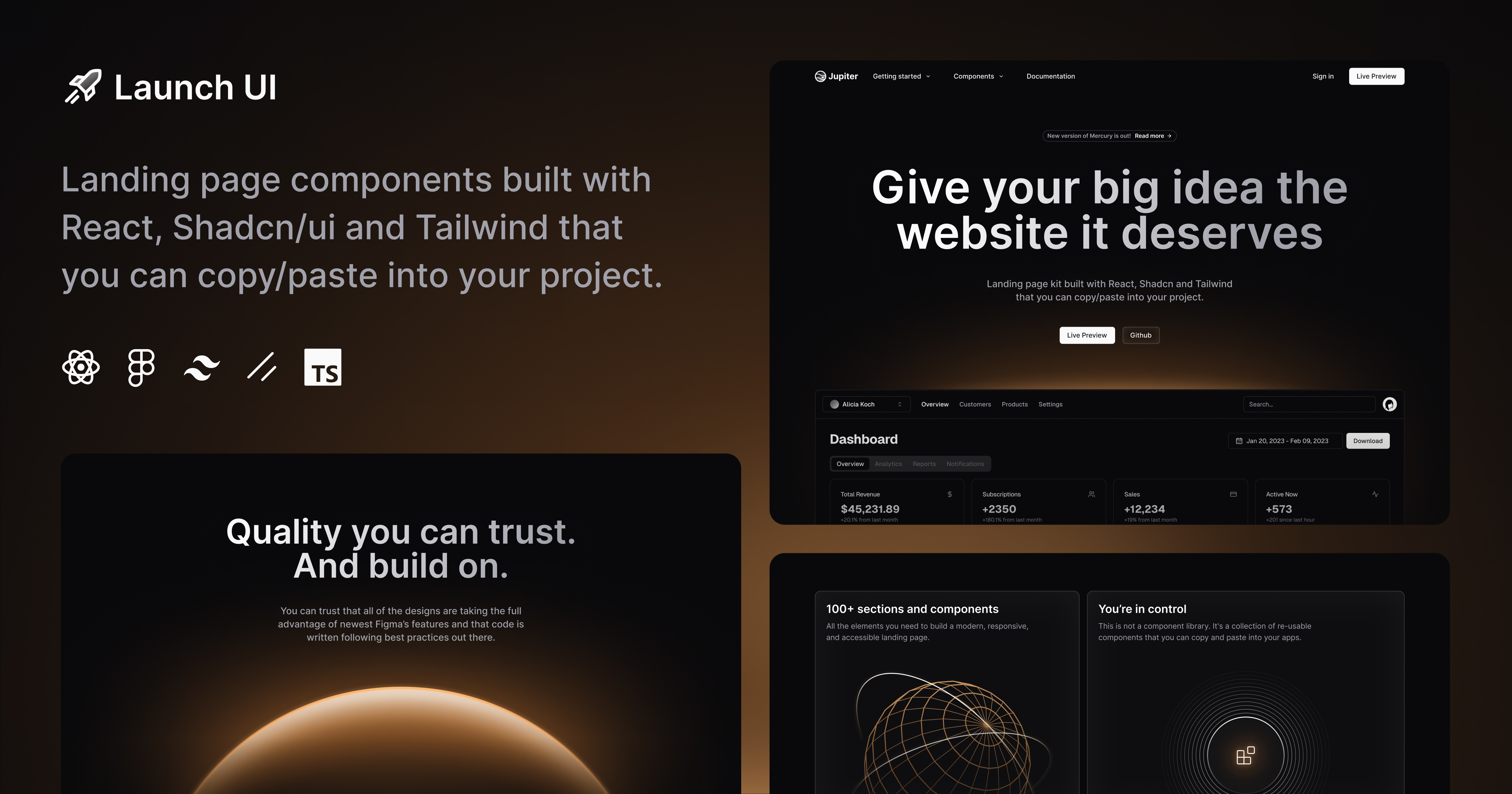
Launch UI is a landing-page-focused block and template library built with React 19, shadcn/ui, and Tailwind CSS, versioned at v2.9. Blocks cover every section a marketing site needs: Hero (multiple variants), Top Navbar, Bento Grid, Carousel, FAQ, Feature, Gallery, Items, Logos, Pricing, Social Proof, Stats, Tabs, Testimonials, CTA, and Footer. Supports multiple color themes (ember, fire, ultraviolet, titanium, ice, holo, emerald, electro) and border-radius tokens. Includes Illustrations and full-page Templates. Free and open source, with an optional paid course. Use for: rapidly assembling polished, on-brand SaaS or product landing pages without designing every section from scratch.
Install
npx shadcn@latest add https://www.launchuicomponents.com/r/registry.jsonHealth
Components (24)
Preview
Live sandbox previews render component source client-side. Where a component can’t be rendered standalone, sh4dcn falls back to its source and install command.
@launchui · launchui
npx shadcn@latest add https://www.launchuicomponents.com/r/launchui.jsonView source