Registries
ActiveComponent library (general)25

@lumiui

Component library (general) · MIT · data updated 2026-07-28

Lumi UI is a composable React component library built on Base UI (MUI team's headless primitives) and Tailwind CSS, offering both pre-assembled composite components and raw primitive building blocks. Ships form and input components (Form, Input, Autocomplete, Combobox, OTP Field, Number Field, Select, Slider, Switch, Textarea), layout and navigation (Accordion, Tabs, Command Menu, Navigation Menu, Scroll Area, Sidebar), overlays (Dialog, Alert Dialog, Context Menu, Drawer, Dropdown Menu, Popover, Sheet, Tooltip), feedback (Meter, Progress, Toast), and display (Avatar, Chart, Resizable, Toolbar). Multiple built-in themes (Dune, Canopy, Celeste, Lagoon, Orchid). Use for: teams that prefer Base UI's accessibility model over Radix UI while still wanting Tailwind-styled, fully owned components.
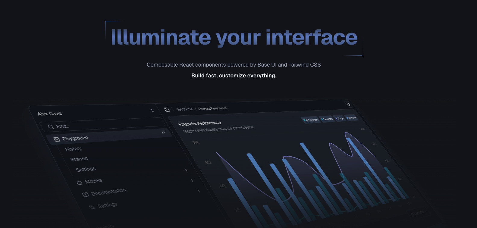
@lumiui preview
accessibilityauthblocksbuttonscardschartscomponentsdashboarddesign-systemformshooksloadersmediamobilenavigationonboardingoverlaystheming

Install

npx shadcn@latest add https://www.lumiui.dev/r/registry.json

Health

StatusActive
Last commit3 weeks ago
LicenseMIT
Open issues0
ArchivedNo
Stars25

Components (67)

uichat-inpututilsuse-mobileaccordionavataralert-dialogdialogdrawertabsscroll-areapopoverdropdown-menuautocompleteinputbuttoncheckboxswitchselectnavigation-menucollapsiblecommand-menupreview-cardprogressfieldfieldsetformradiotooltiptoggletoggle-grouptoastcheckbox-groupsliderseparatornumber-fieldmeterotp-fieldtoolbarcontext-menucomboboxmenubarsheetresizablearrow-svglabelsidebartextareachartbreadcrumbbadgecardkbdskeletonsidebar-01sidebar-02dialog-01dialog-02project-status-pickerexpandable-dialog
Components: ui, chat-input, utils, use-mobile, accordion, avatar, alert-dialog, dialog, drawer, tabs, scroll-area, popover, dropdown-menu, autocomplete, input, button, checkbox, switch, select, navigation-menu, collapsible, command-menu, preview-card, progress, field, fieldset, form, radio, tooltip, toggle, toggle-group, toast, checkbox-group, slider, separator, number-field, meter, otp-field, toolbar, context-menu, combobox, menubar, sheet, resizable, arrow-svg, label, sidebar, textarea, chart, breadcrumb, badge, card, kbd, skeleton, sidebar-01, sidebar-02, dialog-01, dialog-02, project-status-picker, expandable-dialog, morphing-dialog, vercel-notification, t3-model-selector, slider-video-trimmer, team-switcher, collapsible-file-tree, onboarding-dialog

Preview

Live sandbox previews render component source client-side. Where a component can’t be rendered standalone, sh4dcn falls back to its source and install command.

@lumiui · ui

npx shadcn@latest add https://www.lumiui.dev/r/ui.json
View source