Registries
ActiveAnimated components294

@scrollxui

Animated components · data updated 2026-07-28

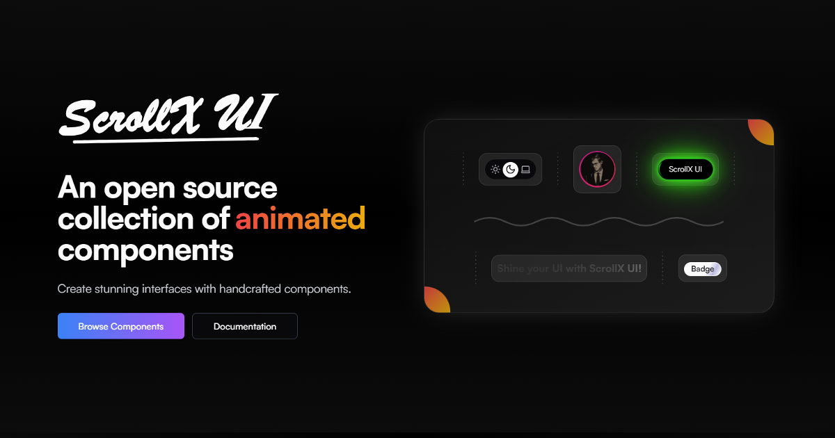
ScrollX UI is an open-source, motion-rich React component library with 140+ animated, interactive components and 30+ marketing blocks, all in TypeScript + Tailwind CSS format. Components span text animations (electric text, decorated text, fancy text), interactive elements (hold-to-confirm, drag interactions, expandable dock, expandable cards, card tilt, card flip), backgrounds (aurora dots, meteors, grid, cosmic, beam, dot wave), and UI primitives (Globe, Keyboard, Infinite Canvas, Flowing Logos, Avatar Group, Bento Grid). Blocks include Hero Sections, CTA, Pricing, Testimonials, FAQ, Waitlist, Bento, and more. Tailwind v4, React, Framer Motion/Motion. Free (MIT). Use for: building visually expressive marketing pages, SaaS landing pages, or developer portfolios that need modern motion-driven components and marketing section blocks.
@scrollxui preview
3daestheticanimationauthbackgroundsblocksbuttonscardsdesign-systemformsglassmorphismhooksiconsloadersmapsmarketingmediamobilenavigationonboardingoverlayspaymentsretrosaas

Install

npx shadcn@latest add https://www.scrollxui.dev/registry/registry.json

Health

StatusActive
Last commit1 month ago
License
Open issues0
ArchivedNo
Stars294

Components (180)

utilsaccordionalert-dialoganimated-buttonanimated-tabsanimated-testimonialsanimated-textgenerateannouncementaspect-ratioavataravatar-groupaurora-dotsbackgroundmeteorsbackground-pathsbadgebarswavebeams-upstreambento-gridbolt-strikeborder-glidebuttoncardcard-flipcard-tiltcarouselcalendarcheckbox-prochecklist-cellclockcodeblockcollapsiblecolumnlinescosmic-backgroundcursor-highlightcursorimagetraildecorated-textdot-wavedraggable-avatardrift-carddropdown-menudualsparkselectric-textexpandable-cardsexpandable-dockfacescapefancy-textflashy-cardflex-navbarflipflowflipstackflowing-logosfolderfolder-treefollowcursorglassglowingbordercardglobeglobe-wireframegravityheroui
Components: utils, accordion, alert-dialog, animated-button, animated-tabs, animated-testimonials, animated-textgenerate, announcement, aspect-ratio, avatar, avatar-group, aurora-dots, backgroundmeteors, background-paths, badge, barswave, beams-upstream, bento-grid, bolt-strike, border-glide, button, card, card-flip, card-tilt, carousel, calendar, checkbox-pro, checklist-cell, clock, codeblock, collapsible, columnlines, cosmic-background, cursor-highlight, cursorimagetrail, decorated-text, dot-wave, draggable-avatar, drift-card, dropdown-menu, dualsparks, electric-text, expandable-cards, expandable-dock, facescape, fancy-text, flashy-card, flex-navbar, flipflow, flipstack, flowing-logos, folder, folder-tree, followcursor, glass, glowingbordercard, globe, globe-wireframe, gravity, heroui, hold-toconfirm, hyperlink, infinite-canvas, iphone, input-otp, interactive-input, kbd, keyboard, kinetic-testimonials, label, lamphome, layered-button, layer-stack, layered-text, lean-card, loader, loginform, logo-stepper, lustretext, magicdock, media-card, meteor-orbit, modern-loader, movinglines-background, motioncards, motion-grid, motion-navbar, morphotextflip, morphy-button, navbar-flow, not-found, orb-button, pagination, particles, parallaxcards, pixel-background, pixel-highlight, popover, profilecard, progress, radialflow, radio-group, radial-socials, reel, reveal-text, search-cell, select, sensitive-text, shiny-button, showcase, side-sheet, signupform, slider, slide-text, status, statscount, stagger-button, stagger-chars, statscarousel, stripe-button, striped-grid, spark-waves, splitter, spotlightcard, seperatorpro, scroll-areapro, social-orbit, squonk, table, testimonial-carousel, text-highlighter, text-modifier, text-spotlight, theme-switch, thunder-loader, timeline, top-sheet, toast, toggle-vault, tooltip, transition, typeanimation, venom-beam, vercel-card, wavy-button, whitestripes, bento-with-focus, contact-with-globe, contact-with-pixelbackground, cta-section-with-avatars, cta-section-with-dashed-border, cta-section-with-floating-gallery, download-with-columnlines, download-with-iphone, features-with-panel, features-with-spotlight, footer-with-faded-brand, footer-with-minimal-outline, footer-with-newsletter, footer-with-suite, frequently-asked-questions-with-accordion, frequently-asked-questions-stack, hero-with-cards, hero-with-iphone, hero-with-layers, hero-with-pixelbackground, hero-with-reel, login-minimal, logo-cloud-flipflow, logo-cloud-marquee, logo-cloud-with-minimal-animation, not-found-with-glitchytext, pricing-minimal, pricing-with-switch, signup-minimal, testimonials-with-carousel, testimonials-with-verticalmarquee, testimonials-with-marquee, waitlist-with-iphone, waitlist-with-layers

Preview

Live sandbox previews render component source client-side. Where a component can’t be rendered standalone, sh4dcn falls back to its source and install command.

@scrollxui · utils

npx shadcn@latest add https://www.scrollxui.dev/registry/utils.json
View source