Registries
ActiveFeaturedAnimated componentspro available843

@smoothui

Animated components · MIT · data updated 2026-07-28

A collection of 50+ animated React UI components and blocks built with Tailwind CSS v4, Motion (Framer Motion), and optionally GSAP. Focuses on microinteractions: smooth transitions, gesture feedback, and delightful hover/reveal effects. Categories include UI Components, Interactive Components, Layout Components, and Utility Components. Compatible with shadcn/ui, installable via shadcn CLI or a dedicated SmoothUI CLI. Supports dark/light mode; fully typed in TypeScript. Free (Vercel OSS). Use for: layering polished motion design onto a shadcn/ui project's interactive elements — buttons, modals, cards, text reveals — without building animations from scratch.
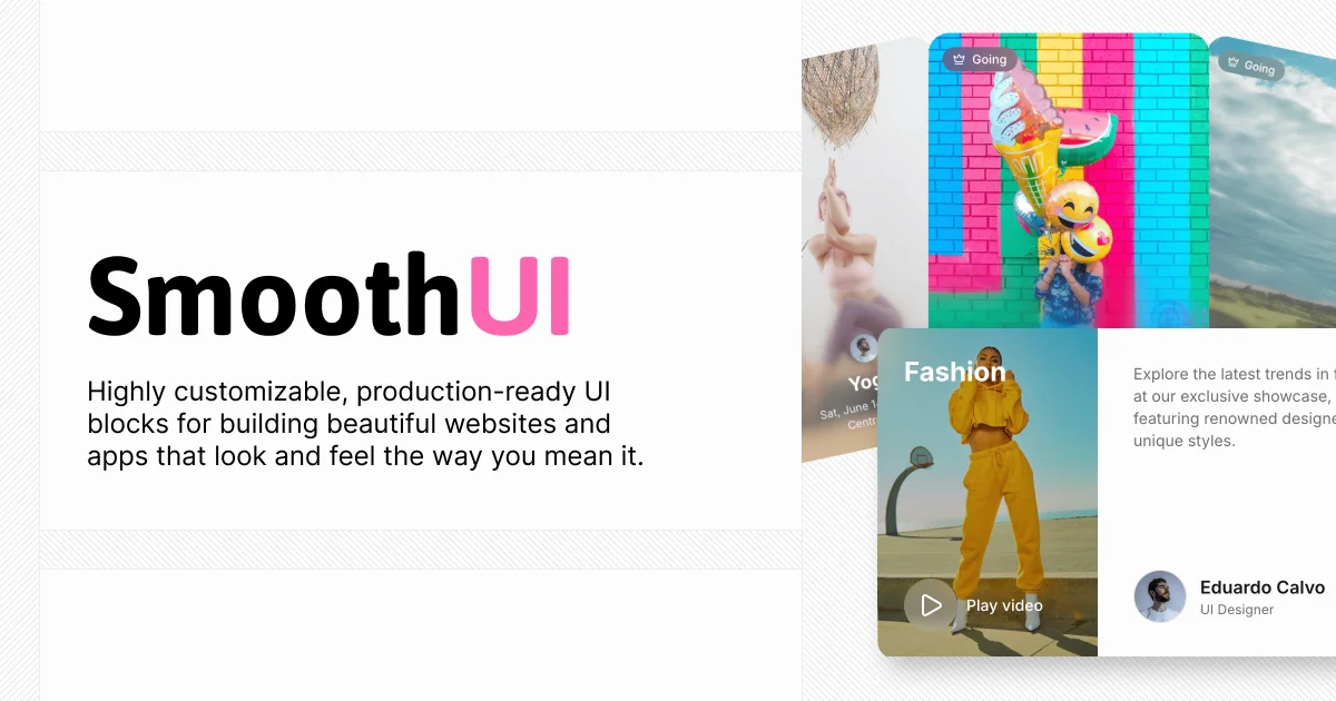
@smoothui preview
aestheticaianimationbackgroundsblocksbuttonscardschartsformshooksiconsloadersmarketingmediamobilenavigationoverlayspro-availabletext-effects

Install

npx shadcn@latest add https://smoothui.dev/r/registry.json

Health

StatusActive
Last commit1 month ago
LicenseMIT
Open issues2
ArchivedNo
Stars843

Components (158)

datacta-1cta-2cta-3faq-1faq-2faq-3faq-4features-1features-2features-3footer-1footer-2footer-3footer-4header-1header-2header-3header-4header-5header-6logo-cloud-1logo-cloud-2logo-cloud-3logo-cloud-4pricing-1pricing-2pricing-3sharedstats-1stats-2team-1team-2testimonials-1testimonials-2testimonials-3agent-avatarai-branchai-inputanimated-avatar-groupanimated-file-uploadanimated-inputanimated-o-t-p-inputanimated-progress-baranimated-stepperanimated-tabsanimated-tagsanimated-toggleanimated-tooltipaperture-blur-transitionapp-download-stackapple-invitesbasic-accordionbasic-dropdownbasic-modalbasic-toastblur-out-upbookbottom-up-lettersbreadcrumb
Components: data, cta-1, cta-2, cta-3, faq-1, faq-2, faq-3, faq-4, features-1, features-2, features-3, footer-1, footer-2, footer-3, footer-4, header-1, header-2, header-3, header-4, header-5, header-6, logo-cloud-1, logo-cloud-2, logo-cloud-3, logo-cloud-4, pricing-1, pricing-2, pricing-3, shared, stats-1, stats-2, team-1, team-2, testimonials-1, testimonials-2, testimonials-3, agent-avatar, ai-branch, ai-input, animated-avatar-group, animated-file-upload, animated-input, animated-o-t-p-input, animated-progress-bar, animated-stepper, animated-tabs, animated-tags, animated-toggle, animated-tooltip, aperture-blur-transition, app-download-stack, apple-invites, basic-accordion, basic-dropdown, basic-modal, basic-toast, blur-out-up, book, bottom-up-letters, breadcrumb, button-copy, checkbox, chroma-blur-transition, clip-corners-button, combobox, context-menu, contribution-graph, cursor-follow, depth-parallax-words, dialog, dot-morph-button, drawer, dropdown-menu, dynamic-island, expandable-cards, exposure-slider, fade-through, figma-comment, focus-blur-resolve, form, github-stars-animation, glow-hover-card, gooey-popover, grid-loader, image-metadata-preview, infinite-slider, interactive-image-selector, job-listing-component, kinetic-center-build, line-by-line-slide, magnetic-button, mask-reveal-up, micro-scale-fade, notification-badge, number-flow, organic-merge-transition, pagination, per-character-rise, per-word-crossfade, photo-stack, phototab, power-off-slide, price-flow, prism-sweep-transition, product-card, radial-circles-transition, radio-group, reveal-text, reviews-carousel, rich-popover, scale-down-fade, scramble-hover, scroll-reveal-paragraph, scrollable-card-stack, scrubber, sdf-blob-transition, sdf-circle-transition, searchable-dropdown, select, shader-reveal-circle-transition, shader-reveal-luma-transition, shader-reveal-noise-transition, shader-reveal-planetary-transition, shader-reveal-push-transition, shader-reveal-stripes-transition, shader-reveal-transition, shader-reveal-wipe-transition, shader-reveal-zoom-transition, shared-axis-x, shared-axis-y, shared-axis-z, shimmer-sweep, shine-text, short-slide-down, short-slide-right, siri-orb, skeleton-loader, smooth-button, social-selector, soft-blur-in, spring-scale-in, stagger-from-center, stagger-from-edges, switchboard-card, top-down-letters, tweet-card, typewriter-text, user-account-avatar, warped-circle-transition, wave-text, lib, theme-candy, theme-indigo, theme-blue, theme-red, theme-orange, theme-green, skill

Preview

Live sandbox previews render component source client-side. Where a component can’t be rendered standalone, sh4dcn falls back to its source and install command.

@smoothui · data

npx shadcn@latest add https://smoothui.dev/r/data.json
View source